Typography

Learn how to work with fonts, lay out typography, pair different typefaces, and find collections of inspiring fonts to use in your next project.

20+ Best Places to Find Free Fonts

Font Collections / 13 Dec 2023

20+ Best Places to Find Free Fonts

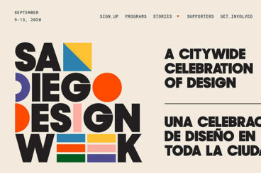
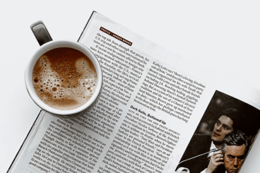
Typography plays a big role in all types of designs, from product packaging to mobile apps and more. Today we’re taking a look at the best places to find free fonts, and take your design work to a new level.

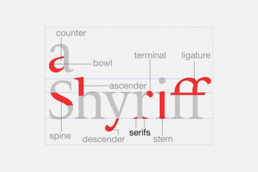
But why is typography so important? Remember what happened at the Oscars 2017, when they gave the Best Picture award to the wrong film? Typography is to blame for that huge mess. As the creative strategist Benjamin Bannister points out, a simple change in the font and the design could have helped avoid such an embarrassing incident.

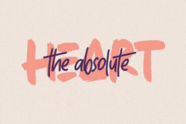
This is why it’s important to have more options when designing a new project. Don’t settle for those overused default fonts. Be brave enough to try something new.

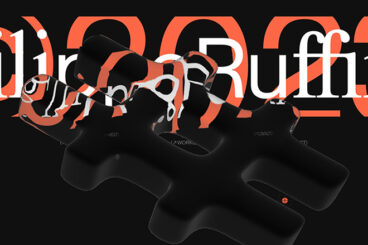
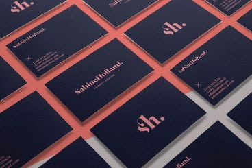
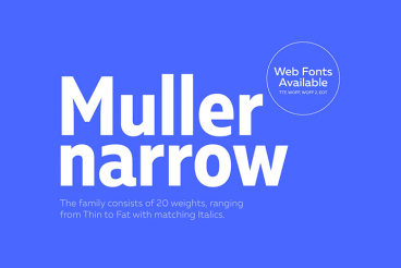
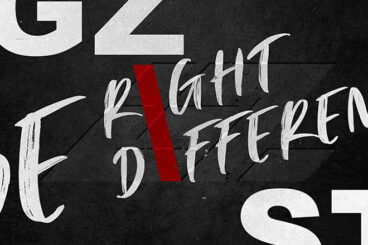
There are many places you can download a great looking font free of charge. We narrowed down the list to the top 20 websites for finding free fonts. Have a look.

30+ Typography Trends for 2024

Font Collections / 21 Nov 2023

30+ Typography Trends for 2024

Want to give your design a quick facelift? Using new and interesting typography trends might be the answer. Designers are using bold colors, cutouts, gradients, and even customizations to create lettering that stands out.

Changing typefaces or recreating an image or header in a trending style can give a design a fresh look without a full-scale overhaul. Not sure where to start? This list features typography trends with examples to use as inspiration for how to use them.

Here’s a look at the top typography trends this year.

8 Rules for Creating Effective Typography

Graphics / 12 Oct 2023

8 Rules for Creating Effective Typography

Today we’re going to discuss something that is both a hot trend and timeless art: typography. The basic rules outlined below will help you become more aware of how you structure and use typography in your designs.

Being conscious of these rules can improve nearly everything you create that contains a headline or major typographic element. Let’s get started!

What Font Do Newspapers Use? Examples & Ideas

Font Collections / 6 Sep 2023

What Font Do Newspapers Use? Examples & Ideas

Fonts play an instrumental role in making the content of newspapers legible, inviting, and engaging. Their choice can influence the reader’s mood, ensuring the news is conveyed as effectively as possible.

Newspaper fonts have evolved over time, but they continue to be dominated by a handful of traditional and reliable typefaces that ensure readability and maintain a professional, authoritative look.

In this article, we will delve into the world of newspaper typography, explore the fonts historically used, and look at modern examples.

How to Master Font Pairings: For Script, Serif, Sans Fonts & More

Font Collections / 5 Sep 2023

How to Master Font Pairings: For Script, Serif, Sans Fonts & More

Finding the right font pairing is an essential part of crafting every design. When creating contrast, improving readability, and showcasing attention to detail, well-paired typography goes a long way to creating visual harmony.

How do you find the ideal font pairs that go well together? What are the key features of good font combinations? Let’s find out.

In this font guide, we explore some of the best combinations for different styles of fonts from serif to script and more. We will also show you examples of great font pairings, including popular Google Font combinations, along with tips on how to pick the right font pairs for different designs.

What Are the Easiest Fonts to Read? Tips & Advice

Font Collections / 17 Aug 2023

What Are the Easiest Fonts to Read? Tips & Advice

Typography is an essential aspect of design that significantly influences how your audience perceives your content. Whether you’re designing a website, writing an article, creating a presentation, or crafting any form of visual communication, the font you choose plays a critical role.

One of the key considerations when selecting a font is readability, as this can directly impact engagement and comprehension.

In this comprehensive guide, we delve into the world of fonts, focusing on what makes them easy to read, and providing you with practical advice to enhance your design projects.

What Happened to Readability? the New Age of Funky Designs

Trends / 7 Aug 2023

What Happened to Readability? the New Age of Funky Designs

Sometimes a website design trend comes around that just makes you want to pull your hair out. This is one of those trends – beautiful and funky designs with practically unreadable text. (Why would you put text there if you can’t be expected to read it?)

Now that may be a bit of an exaggeration because in most instances you can figure out what the text is supposed to say. But it’s not easy. And the user has to think. Will people stick around to figure out the design?

Let’s take a look at a few different examples of ways designs are “forgetting” about readability.

Choosing the Best Font for Business Cards: 10 Tips & Examples

Business Card Templates / 25 Jul 2023

Choosing the Best Font for Business Cards: 10 Tips & Examples

One of the smallest things that can be the most difficult to design is a business card. Due to its small size and a need to include a lot of information, choosing the best font for your business cards is important. It has to set the right tone for you (and your business) and maintain a high level of readability.

While there are a lot of amazing fonts out there, not all of them are super easy to read and understand at small sizes. Most printers recommend that the font on a business card not drop below 8 points (that’s pretty small), so a highly readable option for anything this size is vital.

Here, we’ll look at 10 of the best fonts for business cards and ways you can make the most of these typefaces. Plus, we have a few examples of business card designs that are sure to inspire you.

30 Typography Terms & What They Mean

Font Collections / 24 Jul 2023

30 Typography Terms & What They Mean

If you’re a beginner in graphic design, getting familiar with the specialized language used in the field is key to both your learning and your ability to communicate with other designers. Typography, the art of arranging type, is a fundamental aspect of design, and has its own extensive vocabulary. Understanding these terms can enhance your appreciation for the subtleties of great design and help you make more informed design choices.

Terms like kerning, leading, and serifs are often thrown around in the design world, but what do they actually mean? From basic terms to more complex concepts, knowing the language of typography can transform how you approach your work.

It can help you understand what makes a certain design or font work, or why it doesn’t. A clear understanding can lead you to more purposeful design decisions and ultimately, more impactful work.

In this article, we’ll explore 30 essential typography terms and their meanings. This will give you a good grounding in the language of typography, and whether you’re a graphic designer, a web designer, or just someone interested in design, you’ll find this glossary useful. Let’s dive in!

80+ Best Condensed & Narrow Fonts of 2024

Font Collections / 30 May 2023

80+ Best Condensed & Narrow Fonts of 2024

Contrary to popular belief, condensed and narrow fonts don’t make your text cramped or crowded. You just have to know the appropriate time and place to use the font. Condensed fonts are widely used these days for headlines and portraying bold messages, and when deployed in the right place, they can give stunning impact!

It takes a lot of testing and experimenting to find the perfect font for a design, but our tips for choosing and working with condensed and narrow fonts will help get you off to a great start!

How to Design With Handwritten Typefaces: 10 Tips

Font Collections / 27 Apr 2023

How to Design With Handwritten Typefaces: 10 Tips

Plenty of designs – both in print and online — are featuring handwritten typefaces in a big way. From custom options to fonts that you can sync online or buy for print projects, this flair for letting is quite popular. The most trendy use is as a dominant headline element in a hero header-style homepage design.

This style can be tricky to use, though, and is not a fit-all solution. Today, we’ll look at eight ways to make the most of the handwritten typeface trend in your design projects.

5 Tips for Designing With Graffiti Fonts

Font Collections / 24 Apr 2023

5 Tips for Designing With Graffiti Fonts

Graffiti fonts can add a cool or edgy vibe to design projects, but can be a bit tricky to use if you aren’t careful. The reason for caution mostly lies in readability, due to letterforms that might be somewhat irregular or touch and merge in different ways.

For the right projects, though, graffiti fonts can be a fun way to add something special and really get to the heart of the emotional connection you want to make with the design.

We’ve put together five tips to help you use graffiti fonts well with five extra graffiti fonts you can download and use from Envato Elements.