Typography - Page 5

Learn how to work with fonts, lay out typography, pair different typefaces, and find collections of inspiring fonts to use in your next project.

How to Start and Promote an Illustration Project

Graphics / 8 May 2017

How to Start and Promote an Illustration Project

Illustration projects can be tough. But if you are an illustrator, it is your job (duty even) to keep drawing and promoting illustration projects. But how do you do it?

How can you sell a client on the concept of an illustration when it can be difficult for them to imagine? You can do it. Here are some tips for getting started. (Plus, this post includes illustration projects to help jumpstart your creativity.)
Stunning Examples of White Space… That Aren’t White at All

Graphics / 1 May 2017

Stunning Examples of White Space… That Aren’t White at All

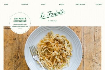
When you think of white space in web design, examples such as Apple or Google are probably the first ones that come to mind. While these companies do a great job of using white space in their designs, there are plenty of other ways to make the most of space.. even if it isn’t always white.!

White space is an important part of your design plan. Here, we’re going to look at the importance of space as a design tool and five examples of websites that are making great use of white space (that isn’t white at all).

Good Design Starts With Real Content

Business / 10 Apr 2017

Good Design Starts With Real Content

You’ve probably heard the phrase “content is king.” Cliches aside, it really is. When it comes to website design, quality content is the cog that powers usability, user flow and conversions.

You need real and authentic elements to create a connection with users to engage them. The best designs start with content that is close to the final product, and designers should be reluctant to work with anything less. But what is real content anyway? Here’s a guide to get you started.

Tips for Using Contrast to Enhance Readability

Typography / 15 Feb 2017

Tips for Using Contrast to Enhance Readability

Good design is readable design. Without a clear message, displayed in an easy-to-digest way, it’s easy to lose the meaning of any piece of design work. That’s why it’s so crucial that any design must be easy to read.

Designing for readability is a lesson in typography, but also in contrast. Contrast is the key to enhancing readability, and helping create a flow through the text in a logical manner so that users understand exactly what you want to say.

7 Rules for Creating a Simple Design

Graphics / 18 Jan 2017

7 Rules for Creating a Simple Design

Keep it simple, stupid. This concept dates to 1960 when the U.S. Navy implemented the KISS principle, which maintains that most systems work best if they are simple, rather than complicated. The same is true of pretty much any design project as well.

Most graphic designers learn about KISS early in their careers. So how can you do it? Creating a simple design is a little more complicated than you might think. Here are seven rules to design by, that help you cut away all the clutter and create a beautifully simple account.

Typography in Shared Spaces: A Trend You Need to Know

Trends / 19 Dec 2016

Typography in Shared Spaces: A Trend You Need to Know

It seems like such a simple concept, but this trend is just starting to take off. Designers are allowing typography to cross planes between elements.

The trend is exemplified by type starting in one part of the canvas and then it extends into the space of something else, such as overlapping part of a photo or encroaching on another colored box or image. The layering technique is interesting and can help add a bit of creativity to a design in a number of ways. Here’s a closer look at ways to use typography in shared spaces.

Choosing the Right Display Typeface: 5 Tips for Success

Graphics / 31 Oct 2016

Choosing the Right Display Typeface: 5 Tips for Success

One of the biggest trends in web design is a large hero image or video at the top of a page with a few words to guide users into the site. This kind of aesthetic puts a lot of pressure on the designer to come up with just the right display typeface to pull the design together.

With so many typefaces to choose from, this can be a bit of a daunting task. But you can find a great typeface with a little planning and luck. Here are five tips to get started with a few beautiful examples of display typography.

What Needs to Be in Your Style Guide? (And How Do You Enforce It?)

Business / 1 Jun 2016

What Needs to Be in Your Style Guide? (And How Do You Enforce It?)

Everyone with a website needs a style guide. It’s that simple. If you’re wanting to instil more consistency in your project, and get everyone on the same page, your style guide will become invaluable.

Now that we have that out of the way, what exactly do you put in that guide? And how do you make sure other people on the team follow the rules so that your visual presence maintains consistency? That’s a little more complicated. Let’s dive into the topic today.

Design Trend: The Modern Retro Touch

Graphics / 16 May 2016

Design Trend: The Modern Retro Touch

You’ve probably heard the saying “everything old is new again.” The same can be said about design and design trends. While the medium might change, many of the old styles can come back into fashion.

One example of this is modern retro design. Today, we’re going to take a look at what modern retro is all about and how you can make this most of it in your design projects. What’s really nice about modern retro is that it works across mediums. While we are seeing a lot of it in website design right now, modern retro adds a fun touch to print projects from business cards to poster design to party invitations.

Design Trend: Square-Stacked Typography

Trends / 25 Apr 2016

Design Trend: Square-Stacked Typography

Everywhere you look these days, it seems like someone else is using stacked typography. Particularly square stacked typography. It’s a common design trend that we’re seeing more and more.

The trend is hard to ignore, and is worth replicating because this aesthetic is charming and impactful. There are plenty of ways to combine words and lines of lettering to create a design that is attention-grabbing. Today, we’ll look at exactly how to make the most out of the square stacked typography trend with examples from the Design Shack gallery. Read on for some great examples, and helpful tips!

What Does That Say? How Typefaces Add Meaning to the Design

Typography / 6 Apr 2016

What Does That Say? How Typefaces Add Meaning to the Design

Can something as simple as a typeface change the meaning of words and an entire design. Of course! A typeface can add a new level of emphasis or meaning to your message.

It can help you connect with users, establish brand, and set the tone for your entire project. The wrong typeface can leave a design feeling flat, disjointed or even give users the wrong impression about your brand. Now let’s take that knowledge and add a little practical application. (And look at a few examples of beautiful typography from the Design Shack gallery.)

Web Design Best Practices: Minimalism & Typography

Minimalist Graphic Design / 5 Apr 2016

Web Design Best Practices: Minimalism & Typography

When talking about design we need to consider text from a designer’s perspective. Text must be legible and readable while fitting nicely with the website’s style. But it also must relate to a hierarchy of content.

Building hierarchies is the “big picture” of a website’s composition. But as you move into typography, you also must create hierarchies related to specific text on the page. In this piece, we’ll explain creating relationships with your headers and how to use white space to make lengthy paragraphs visually digestible.