Typography - Page 6

Learn how to work with fonts, lay out typography, pair different typefaces, and find collections of inspiring fonts to use in your next project.

5 Ways to Boost Contrast in Your Web Design

Accessibility / 25 Feb 2016

5 Ways to Boost Contrast in Your Web Design

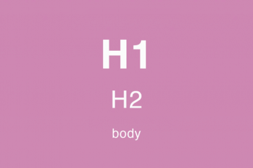
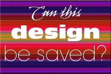
Is your design project lacking that special pop? It’s likely what you are missing is enough contrast. Contrast provides differentiation between elements, making each one look more individual, prominent and special.

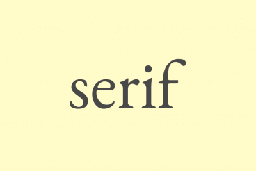
Design contrast is created in a number of ways, and using all different types of elements. From typography to color to space, creating contrast can take a design from bleh to wow. Here are five ways to do it.

3 Typography Trends for 2016 (With Examples)

Typography / 20 Jan 2016

3 Typography Trends for 2016 (With Examples)

Design trends. You can hardly do anything without seeing them, they pop up everywhere, and they can give your design feel “current” when used well.

Today, we’re going to take a look specifically at three typography trends and why we hate to love them. While these three styles – retro, watercolor and all caps – are everywhere, designers just can’t help but love them (even if they don’t want to). Here’s why, paired with some excellent examples of the trends in use.

9 Tips for Better Typographic Hierarchy

Layouts / 30 Dec 2015

9 Tips for Better Typographic Hierarchy

Every project requires a system and hierarchy for text elements. Just think about all the small pieces of text that are used throughout a design – headlines, body copy, navigation elements, legal information, captions and so on.

But how do you create that hierarchy so that every text element flows smoothly to the next? Today, we’ll take you step-by-step through building a system of typography hierarchy that can be used for almost any design project. (And we are pairing the tips with beautiful examples of great typography to help you gather a bit of inspiration.)

What Comes First? the Copy, or the Typeface?

Typography / 2 Nov 2015

What Comes First? the Copy, or the Typeface?

We have a sort of chicken and egg dilemma today: What comes first? The copy, or the typeface? There is a fine line between designing with or without the words.

Typography and design can alter what you think about when you read words. Think back to the process. Do you pick a typeface first or wait for the copy? (Without giving too much away, the secret is collaboration. If you don’t work together, you’ll only end up with a blank canvas.) Here are a few different scenarios and suggestions.

Web Design Debate: Do I Really Need to Use Sans Serif Fonts?

Typography / 26 Oct 2015

Web Design Debate: Do I Really Need to Use Sans Serif Fonts?

There’s long been a theory that serif typefaces are for printed projects and sans serifs are for website design. But with more high definition screens and great type options available, that rule just isn’t so much a rule anymore.

Whether you prefer serifs or sans serifs (or a combination of the two), the main objectives when choosing typefaces for digital design projects should be readability and legibility. Simple, you need to pick fonts that are sharp and easy to read on the screen. Part of this is related to usage, such as size and placement of text, and then to the style of typeface you choose.

Kinetic Typography: An Introductory Guide

Typography / 5 Aug 2015

Kinetic Typography: An Introductory Guide

Kinetic typography seems to be everywhere these days. From television commercials to website landing pages, movable type is a popular visual tool. This popularity could come from a number of reasons but one obvious factor is that it catches your attention. People tend to be drawn to words and want to read them.

Kinetic typography puts this together with some simple animations to create words that move on the screen, grabbing your attention and engaging the senses. So let’s take a look at kinetic typography and how you can integrate it into some of your design projects. (Note: The examples in this article include animation; click the images for links to the original sources to see them in action.)

Typekit vs. Google Fonts: Pros and Cons

Google Fonts / 21 Jul 2015

Typekit vs. Google Fonts: Pros and Cons

Choosing the right font is an important aspect of any web design project. There are hundreds, even thousands, of great options out there and many can be used with free licenses thanks to tools such as Adobe Typekit and Google Fonts.

But is one service better than the other? Is there a benefit to Google Fonts or Typekit over the other? And just how can you get started with these tools if you have not used them yet. You are in luck, because today we’ll answer those questions.

Can You Fix a Bad Design? Here’s Where to Start

Graphics / 16 Jun 2015

Can You Fix a Bad Design? Here’s Where to Start

It’s an hour before deadline and your boss just handed you a design project to finish up. And it’s bad. Very bad. It has problems ranging from poor images to crazy color, typography choices to general sloppiness. What should you do? Can it be fixed?

There are a few things you can do to help salvage a bad design with the understanding that it won’t be perfect. But making it passable as a design project for your company might well still be an option. Here’s how!

8 Ways to Kern Any Typeface Like a Professional Typographer

Typography / 27 Apr 2015

8 Ways to Kern Any Typeface Like a Professional Typographer

Kerning is a subjective art. Every designer may feel differently about how combinations of letters look together. Most though can agree that almost every bit of type needs a little kerning.

Kerning – the adjustment of space between two letters – is something the untrained eye can rarely see. Good, or poor, kerning is more of a feeling as to whether type works or not. Here we have eight tips to keep you from falling into the auto-kerning trap so that you can kern type like a pro. (This post is filled with letter combinations; use them as a springboard to thinking about kerning. Do you like the way the letters or numbers work together? How would you kern them differently?)

7 Tips for Choosing the Best Web Font for Your Design

Typography / 30 Mar 2015

7 Tips for Choosing the Best Web Font for Your Design

There’s no way to quantify all of the font options available for website designers. Almost every day a new typeface shows up in my inbox or Twitter feed. But not every one one of these typefaces – no matter how beautiful – is right for designing a website.

When it comes to selecting the perfect font, you have think about a variety of things including compatibility, load time and design purpose. Today, we have seven tips to help you select and use the best web font for your design project.

The Complete Guide to Special Characters

Typography / 21 Apr 2014

The Complete Guide to Special Characters

Not everything is as easy as ABC or 123. Sometimes your copy might require a character outside of the basic alphabet. That’s where special characters and glyphs come in. (Look around, they are more common than you might think at first.)

Depending on your workflow, inserting a glyph can be as simple as a keystroke or a multi-step process. Much of it depends on the software you are using, typography palette and how the final product will be published. Here, we are going to take a look at special characters, examples of use and tips for success.

This Week in Design: April 4, 2014

Typography / 4 Apr 2014

This Week in Design: April 4, 2014

From a teen who made headlines about saving millions of dollars with a font to some of the most impressive design names of our generation, this week in design featured people who make an impact. Whether you like or agree with a theory sometimes does not mean as much as the simple idea that it gets people thinking about something new.

Every week, we plan to a look at major product releases and upgrades, tools and tricks and even some of the most popular things you are talking about on social media. And we’d love to hear what’s going on in your world as well. Have we missed anything? Drop me a line at [email protected].