10+ Best Shadow Fonts
Create depth in your work with our shadow fonts. These fonts add a 3D effect to your text, making it pop out of the page. Ideal for posters, headers, or any design that needs a dramatic touch.
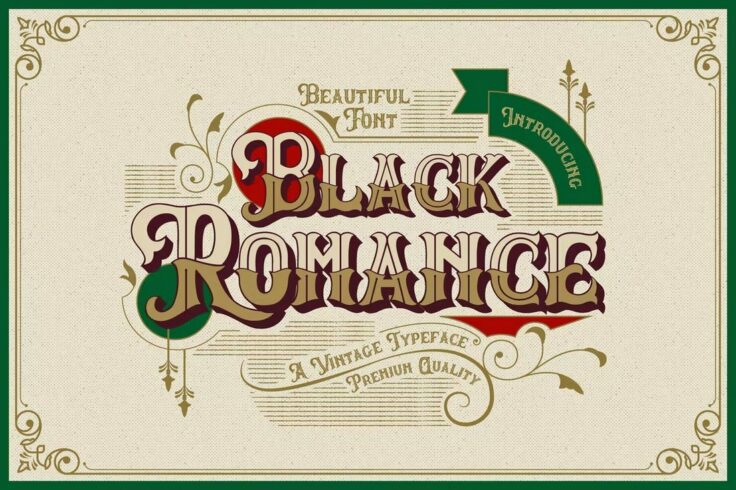
Black Romance Vintage Blackletter Shadow Font
Black Romance is a beautiful vintage blackletter font with creative letters inspired by old English typography. This font is great for label and badge...
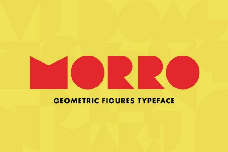
Morro Geometric Shadow Font
Morro is a unique font that consists of letters made of geometric shapes. This font is most useful for logo design and crafting stylish titles for pos...
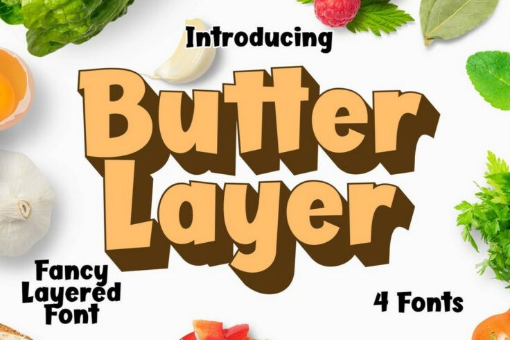
Butter Layer Fun Fonts With Shadow
Looking to craft a fun title for a kids-themed banner or an entertaining poster? Then be sure to download this font. Butter Layer font has a fun lette...

Sevastian Layered Shadow Font
Sevastian is one of the best shadow fonts you’ll find on our list. It features a very unique shadow effect that creates a realistic 3D effect. S...
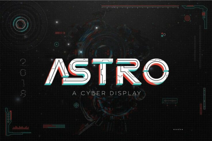
Astro Cyberpunk Shadow Font
Astro is a creative font that features a set of letters inspired by cyberpunk designs. Each letter in this font has a unique textured design and it co...
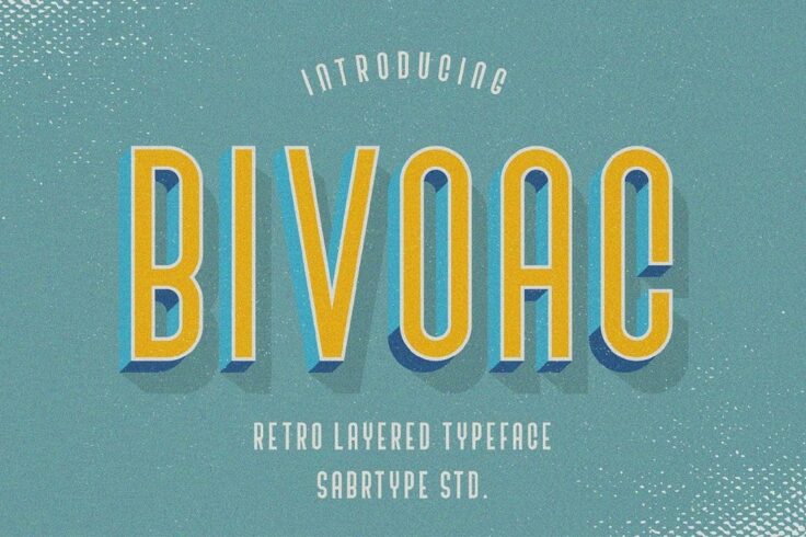
Bivoac Layered Shadow Font
Vivoac is another layered shadow font for the fans of retro designs. The font comes with a classic retro lettering design featuring a shadow effect. I...
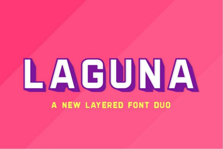
Laguna Regular & Shadow Font Duo
This font has all the right elements of a perfect title font. It has big and blocky characters as well as a clean-cut design. As a bonus, there’...
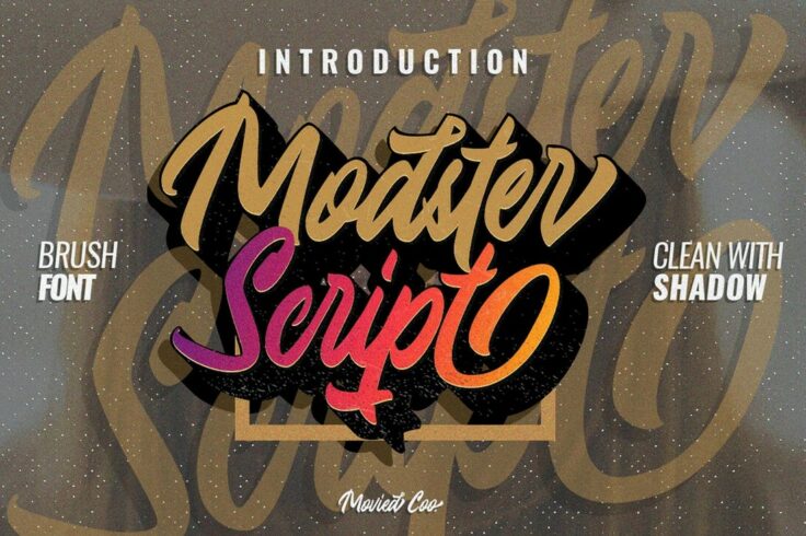
Modster Script Shadow Font
We haven’t seen a better script font that rocks a shadow effect than this one. It’s rare for scripts font to come with a shadow effect sin...
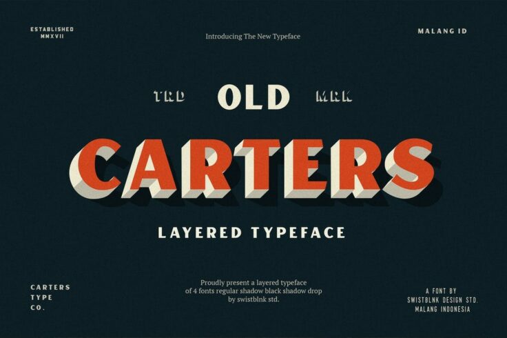
Carter Layered Shadow Font
Carter is a vintage-style font that comes with a lettering design inspired by old-school signage. The font is available in multiple styles including r...
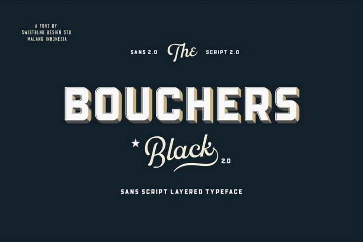
Bouchers Retro Layered Shadow Font
Bouchers is a retro layered font that looks a lot like the typefaces you see on vintage drink bottle labels. The font includes two shadow-style fonts ...
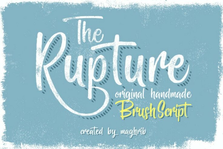
The Rupture 3 Brush Script Shadow Font
This is a very creative brush script font that has a beautiful flowing letter design. It includes two shadow font versions that are perfect for design...
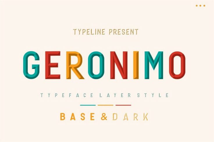
Geronimo Creative Shadow Font
Geronimo has 3 styles of fonts, a regular font and two styles of shadow fonts. One of the shadow fonts creates an inward shadow that gives this font a...
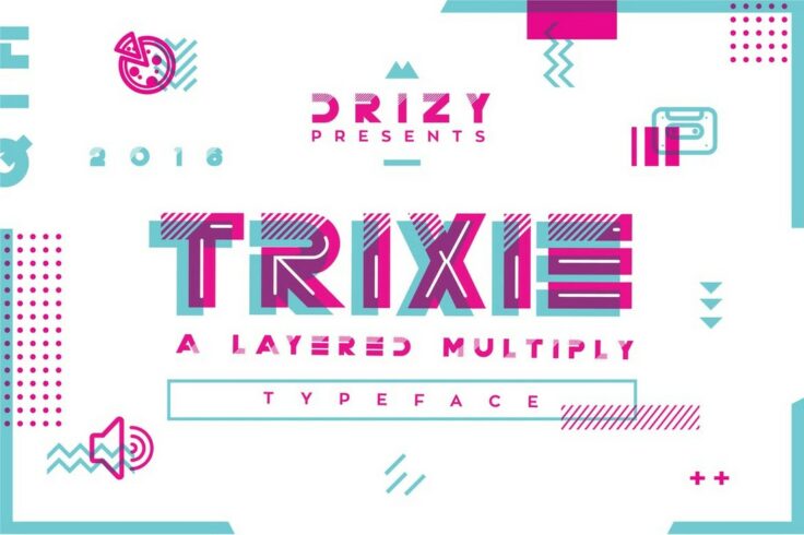
TRIXIE Futuristic Shadow Font
Trixie is a very stylish font with a set of futuristic characters. Each letter in this font has a unique design that will make your designs stand out....
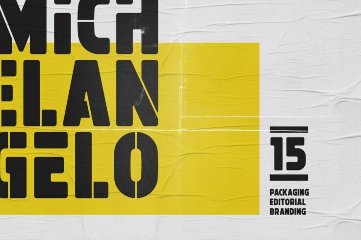
Michelangelo Modern Shadow Font
This is a big family of fonts that has blocky letters and a stencil-like design. There are 15 styles of fonts in this font family, including shadow, o...
FAQs About Shadow Fonts
What is a Shadow Font?
A shadow font, as the name suggests, is a type of typography style that encompasses a shadow effect. Essentially, it refers to text that has a corresponding shadow, which usually appears as a slightly offset duplicate of the text, often in a different color to create the shadow illusion.
Shadow fonts can be used to add a sense of depth or a 3D effect to the otherwise flat text. It gives the text a more dramatic appearance and often enhances legibility, particularly on complex backgrounds or whenever a certain level of stand-out effect is required.
Where are Shadow Fonts typically used?
Shadow fonts are universally versatile and can be used in a variety of platforms. Often, they are utilized in website design, print design, logos, posters, banners, advertising, book covers, titles, or any graphic design project that requires a dramatic and eye-catching effect.
In addition, shadow fonts are particularly popular in comic books and graphic novels, where the bold and dramatic typography helps to enhance the visual experience. They are also commonly used in signage, as the shadow effect can increase visibility and legibility from a distance.
How can I create Shadow Fonts?
Shadow fonts can be created using several software programs. Adobe Illustrator and Photoshop are popular choices, as they offer in-built tools for adding shadow effects to your text. Microsoft Word and PowerPoint also have built-in text effects that allow for the creation of shadow fonts, albeit with somewhat less customization options.
Another method to create shadow fonts is by using online tools and platforms. Web-based systems like Canva are user-friendly and offer a host of customization options to create unique shadow fonts without needing any design skills or experience.
Why use Shadow Fonts?
Shadow fonts can provide several benefits depending primarily on how and where they are used. The shadow effect adds depth and dimension to an otherwise flat text, making it more visually appealing and engaging. The added depth can also enhance the text's readability, especially in circumstances where the background is complex or the contrast between the text and the background is low.
Apart from aesthetics, shadow fonts can effectively highlight or emphasize certain aspects of the content. So, if you're looking to make a statement or draw attention to certain text elements, shadow fonts can be a perfect choice.
Do Shadow Fonts impact legibility?
Yes, shadow fonts can significantly impact legibility, but this can swing both ways – positively and negatively. The shadow effect can amplify the contrast between the text and the background, thereby enhancing readability. This is especially useful for signage or situations in which increased visibility is important.
On the other hand, if the shadow effect is too intense or the color contrast is not appropriately chosen, it can make the text harder to read. Hence, while using shadow fonts, it's crucial to maintain a balance between aesthetic appeal and legibility for the target audience.