Graphics / 5 Jun 2017
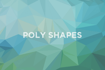
Poly Shapes: A New Design Trend We Love
There’s a new favorite shape in design these days – the polygon. These affectionately called “poly shapes” are popping up on websites, posters and in printed projects. And one of the best parts of this versatile trend is that each of these designs is so different.
Polygons are shapes that are defined in elementary geometry as a “plan figure that is bounded by a finite chain of straight line segments in a loop to form a closed polygonal chain.” The shapes can have any number of sides or orientation, can be filled or hollow and can have paths and strokes that intersect. Polygons are typically flat, two-dimensional shapes, although in website projects some polygons animate move and seem to have more 3-D characteristics.
Polygons are a fun technique for new projects or can bring new life to a design that’s feeling a little stale. Here are a few projects with poly shapes to help jumpstart your next brainstorming session.