Graphics - Page 9

Inspiring advice, tips, and suggestions for improving your graphic design skills, logo design, working with templates, and more.

Pantone’s Color of the Year: Ultra Violet (And How to Use It)

Graphics / 14 Dec 2017

Pantone’s Color of the Year: Ultra Violet (And How to Use It)

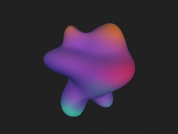
Ultra Violet. It sounds like the name of a pop band. Pantone’s Color of the Year for 2018 is inspired by music and art and individuality.

The color is reminiscent of Prince’s famous purple and it is part of a growing trend in design to use bolder, brighter colors in more projects. Here’s a look at Pantone’s color of the year and how you can use it in your projects.

Design Trend: Obstructed Text

Graphics / 20 Nov 2017

Design Trend: Obstructed Text

Some websites look great, even if they defy conventional wisdom or tenets of design theory. A new design trend is showcasing that very idea with elements that cover or obstruct some of the text in the design.

It’s an interesting trend because it goes against everything we commonly talk about with design – that it must be readable to connect with users quickly.

Needless to say, this can be a tricky technique to pull off effectively, but the designs are striking and impactful when done well. Here’s a breakdown of the trend and some ideas for how you can try it yourself.

Design Trend: Dark Color Palettes & Animation

Graphics / 1 Nov 2017

Design Trend: Dark Color Palettes & Animation

Have you taken note of all the super dark design patterns lately? Designers are experimenting with some funky, dark design patterns that feature animation in the same color scheme.

These animations include everything from simple movements that happen on their own, to hover effects and full cinematic experiences. Let’s dive into this website design trend and explore a few ways to make it work for your projects.

Is the Static Logo Dead?

How to Design a Logo / 23 Oct 2017

Is the Static Logo Dead?

There’s a bit of disruption happening in the world of logos. The single static logo isn’t enough to carry your brand anymore. You actually need a library of logos to meet all the needs of your brand.

This idea has been evolving for a while; just think of the variations for a website, social media and even that tiny favicon in web browsers.

It can be a lot to think about. So let’s try to organize those logo thoughts.

The Greatest Print Campaigns of All Time: Volkswagen Think Small

Graphics / 18 Oct 2017

The Greatest Print Campaigns of All Time: Volkswagen Think Small

You’re a web designer living large in the 21st century. Your job is defined by screens and software. What in the world could you possibly learn about design from a bunch of old dusty print ads? The answer of course, is “a ton.”

Today we’re examining one of the most famous print ad campaigns of all time. The Volkswagen “Think Small” campaign. How did a funny looking car that was named after a bug, known for being slow and manufactured in factories built by Nazis ever become iconic to a generation of post-war Americans? Great design and fantastic marketing.

Design Trend: Vivid Rainbow Colors

Graphics / 16 Oct 2017

Design Trend: Vivid Rainbow Colors

If nothing else, 2017 has been a year of color in website design. Color trends have dominated the conversation about design, with brighter, bolder hues as a large part of the landscape.

There’s a new color trend that combines a lot of those bright options into bigger color palettes that you might now expect – rainbow color patterns. That’s right, more designers are taking a change with a lot of color and incorporating vivid rainbow, gradient colors into design projects. And it’s pretty cool!

Here’s a look at the trend and some ideas for how to use vivid color that aren’t garish.

Tips for Creating a Modern Monochrome Color Palette

Graphics / 9 Oct 2017

Tips for Creating a Modern Monochrome Color Palette

A monochrome color scheme isn’t always the first idea that comes to mind when starting a new design project. But single-color design projects can have a lot of impact and give the opportunity to branch out and try some new techniques.

Monochromatic projects, which consist of a color palette with just one color, can be striking because they aren’t as commonly seen as projects with more color variances. This alone can make your project stand out.

DPI vs. Pixels: What Do I Use?

Graphics / 4 Oct 2017

DPI vs. Pixels: What Do I Use?

You hear these phrases tossed around by everyone today – from amateur photographers, to the iPhone salesman, to some of the world’s most acknowledged visual creators and designers. But what do image size specs really mean? And what should you use?

Simply, it all depends on your project. Knowing what medium you are creating for and how your images will be used is key to sizing and picking the right number of pixels or DPI. Before you begin your next project, though, make sure you are familiar with all the image-quality jargon.

5 Tips for Creating a Memorable Logo Design

How to Design a Logo / 2 Oct 2017

5 Tips for Creating a Memorable Logo Design

A logo might be the single most important visual connection a brand makes with users. It identifies the company or organization and sets a basic tone for interactions with users.

From color to shape to words, every element in a logo design says something. (That’s why such a small element is so important to your brand.)

Logo design takes a lot of planning and thought and it is important to create a mark that represents your business and is something that users can identify and remember. It’s doubtful that you’ll develop the next Nike swoosh, but with the right approach you can create a memorable logo design.

How & Why Faces Increase User Engagement

Graphics / 28 Sep 2017

How & Why Faces Increase User Engagement

There’s a lot of science and psychology that goes into design. Even if you don’t consciously think about it, choices that you make when selecting imagery and user interface elements can establish a connection with users (or not) and even lead to higher engagement rates.

Using actual human faces in the design is one way to do this. Seeing a face can make people more likely to engage with a design because it makes the app/website/poster feel more human. It creates a more distinct emotional connection.

Here, we’re going to look at designs that use faces in different ways and how you can up user interaction with some of the same design techniques.

10 Best Tools & Tips for Choosing a Website Color Scheme

Graphics / 19 Sep 2017

10 Best Tools & Tips for Choosing a Website Color Scheme

Finding the perfect color combination for a website can be a challenging task, especially when you’re trying to make a particular design fit in with a client’s requirements. We’ve picked out a few great color scheme generating tools for you to easily create the perfect palette!

If you’re stuck trying to find the perfect color scheme for a website design, don’t feel bad. It’s OK if you’re not an expert on color palettes. You just need to find the right set of tools to do that job for you.

But, before you go crazy with the color tools, let’s figure out some of the things you need to consider when choosing the right color combination for a design.

5 Tips for Designing the Perfect eBook Cover

Graphics / 18 Sep 2017

5 Tips for Designing the Perfect eBook Cover

People are going to judge your eBook by its cover. The cover is the first impression and first chance you have to hook a reader. It has to be visually appealing, include lettering that’s easy to read and entice users to download (and read) your book.

The perfect eBook cover stands out from all the other books available, communicates what the book is about and sells a benefit to readers for downloading.

That’s a pretty tall order for a design that users are likely to only see for a few seconds (if that) when deciding to make a purchase. But there are design elements you can use to help encourage downloads. Here are five tips to help you design the perfect eBook cover.